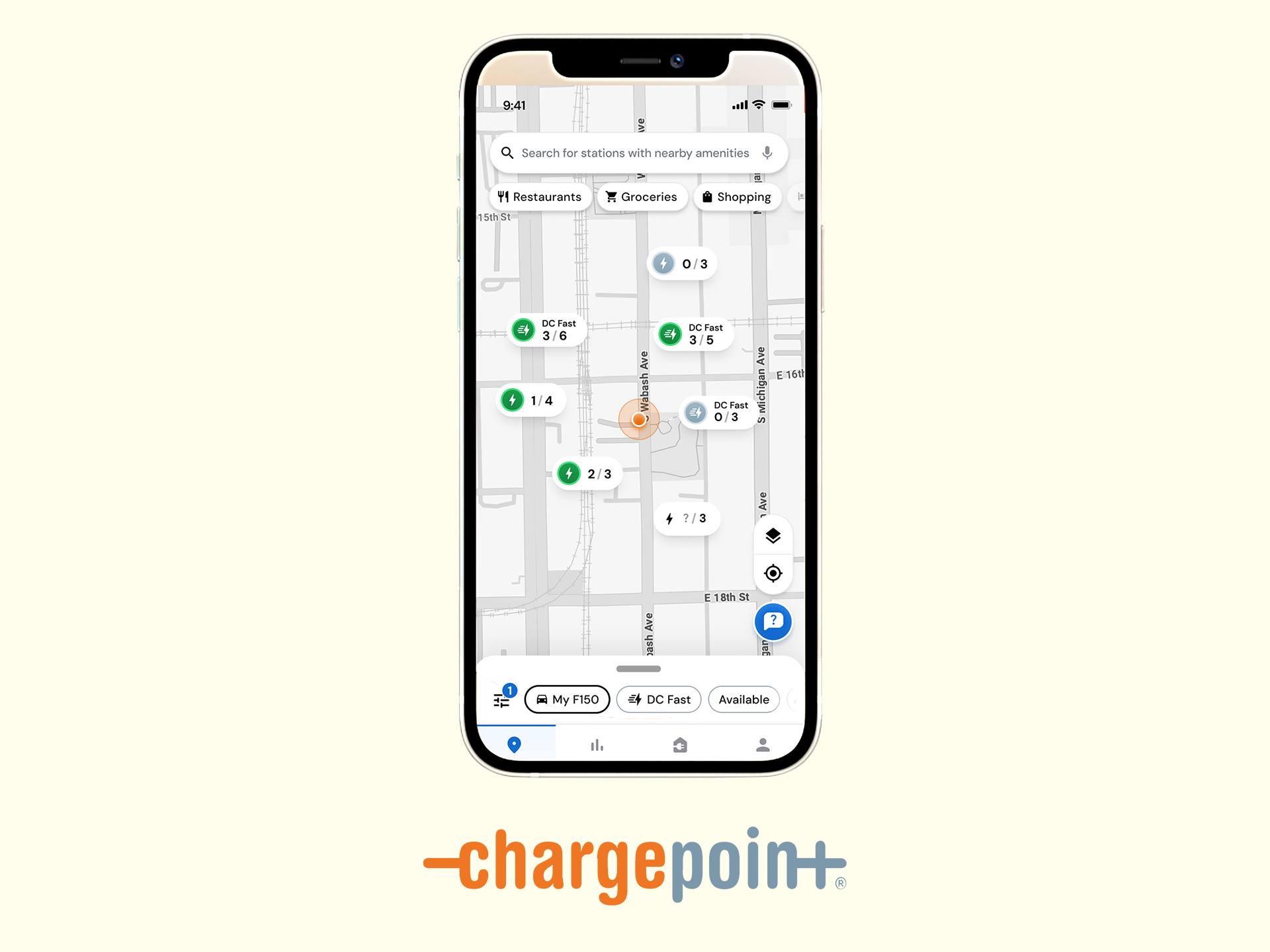
A single system for locating, accessing, and managing EV charging at scale
Impact
ChargePoint delivers a unified mobile experience that enables drivers to:
⚡︎ Discover nearby charging stations
⚡︎ Understand availability and charging status in real time
⚡︎ Onboard quickly across platforms
⚡︎ Manage charging sessions with confidence and clarity
The work introduced structural coherence across fragmented station data, onboarding flows, and account states—reducing cognitive load while increasing trust in the network.
Problem Statement
EV drivers rely on ChargePoint in moments of real-world urgency, yet the experience was constrained by:
⚡︎ Fragmented station information
⚡︎ Inconsistent site and cluster behaviors
⚡︎ Complex onboarding and account recovery flows
⚡︎ Disjointed sign-up patterns across Apple, Google, and email
⚡︎ Fragmented station information
⚡︎ Inconsistent site and cluster behaviors
⚡︎ Complex onboarding and account recovery flows
⚡︎ Disjointed sign-up patterns across Apple, Google, and email
The challenge was not visual polish, it was system legibility at scale.
The Solution
⚡︎ Established a system-level information architecture spanning stations, clusters, and sites
⚡︎ Designed a clear hierarchy for station status, availability, and interaction states
⚡︎ Rationalized onboarding and authentication across Apple, Google, and email login flows
⚡︎ Created consistent UX patterns for account recovery and access continuity
⚡︎ Designed a clear hierarchy for station status, availability, and interaction states
⚡︎ Rationalized onboarding and authentication across Apple, Google, and email login flows
⚡︎ Created consistent UX patterns for account recovery and access continuity
The solution reframed ChargePoint as a navigable system, not merely a map of chargers.
Navigation clarity replaces uncertainty in real-world charging decisions
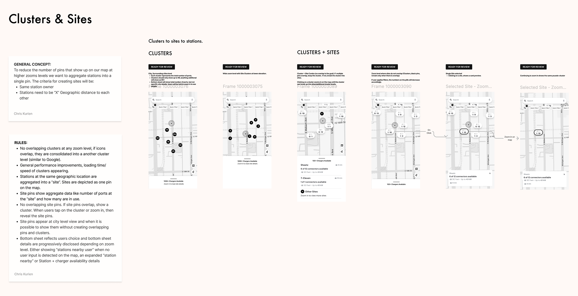
System & Flow Visualization
Clusters & Sites
A structured model defining how:
⚡︎ Individual stations roll up into clusters
⚡︎ Clusters map to physical sites
⚡︎ Site-level behavior informs user expectations and actions
⚡︎ Individual stations roll up into clusters
⚡︎ Clusters map to physical sites
⚡︎ Site-level behavior informs user expectations and actions
This abstraction enabled scalable consistency while accommodating real-world variability.
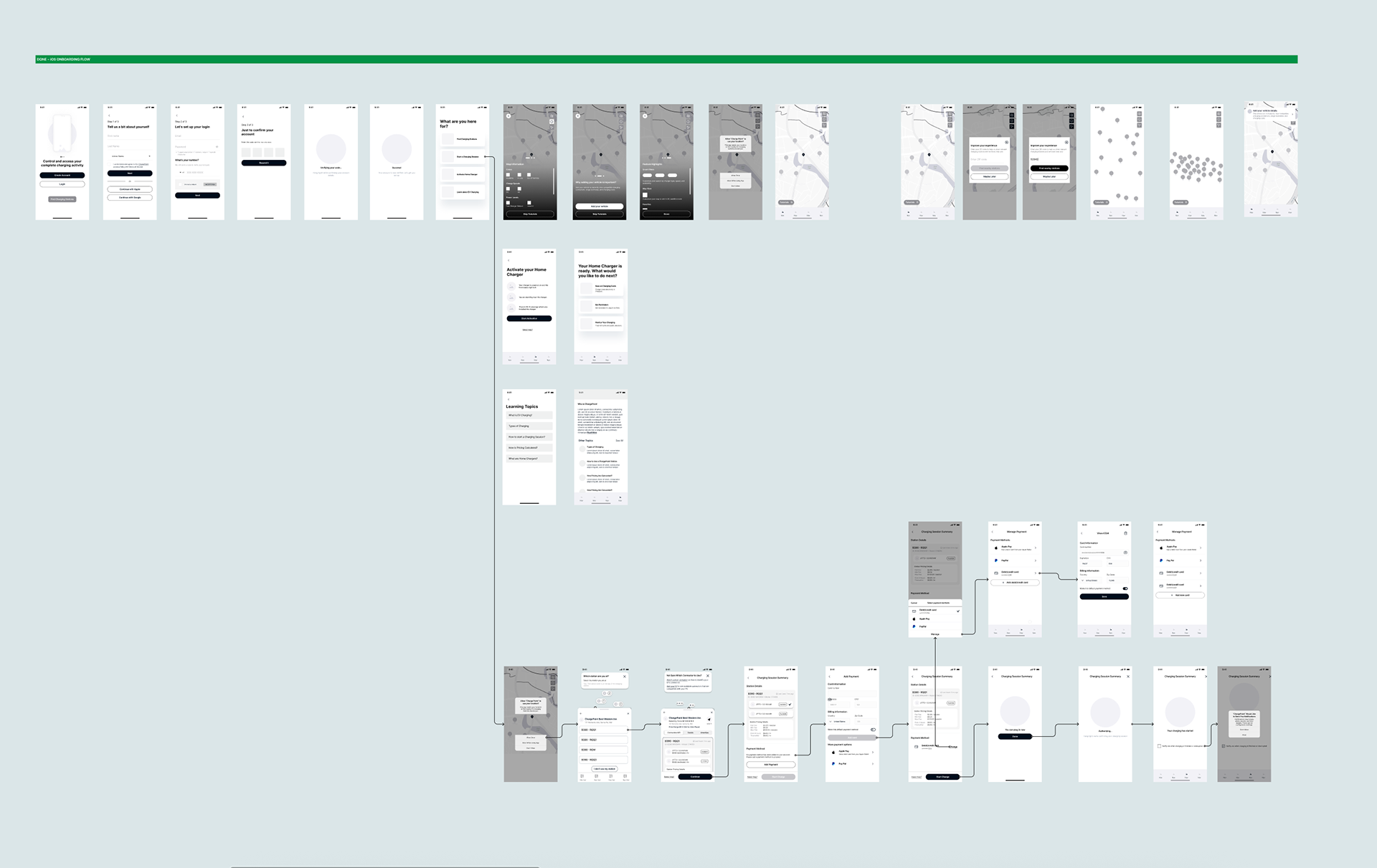
Detailed UX Flows
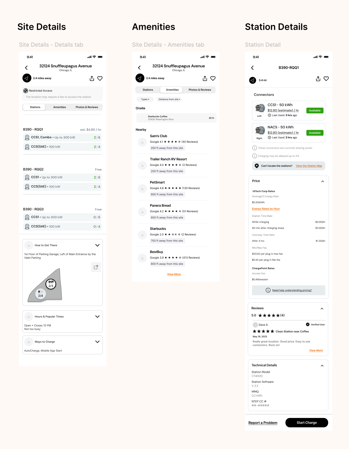
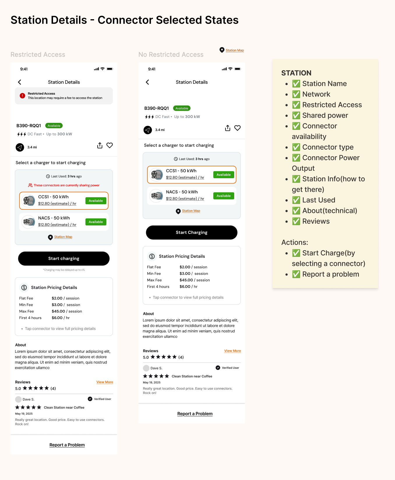
Site & Station Details:
⚡︎ Station availability and status surfaced at the right moment
⚡︎ Actionable information prioritized over raw data
⚡︎ Visual hierarchy tuned for fast, situational decision-making
⚡︎ Station availability and status surfaced at the right moment
⚡︎ Actionable information prioritized over raw data
⚡︎ Visual hierarchy tuned for fast, situational decision-making
Account Access & Continuity
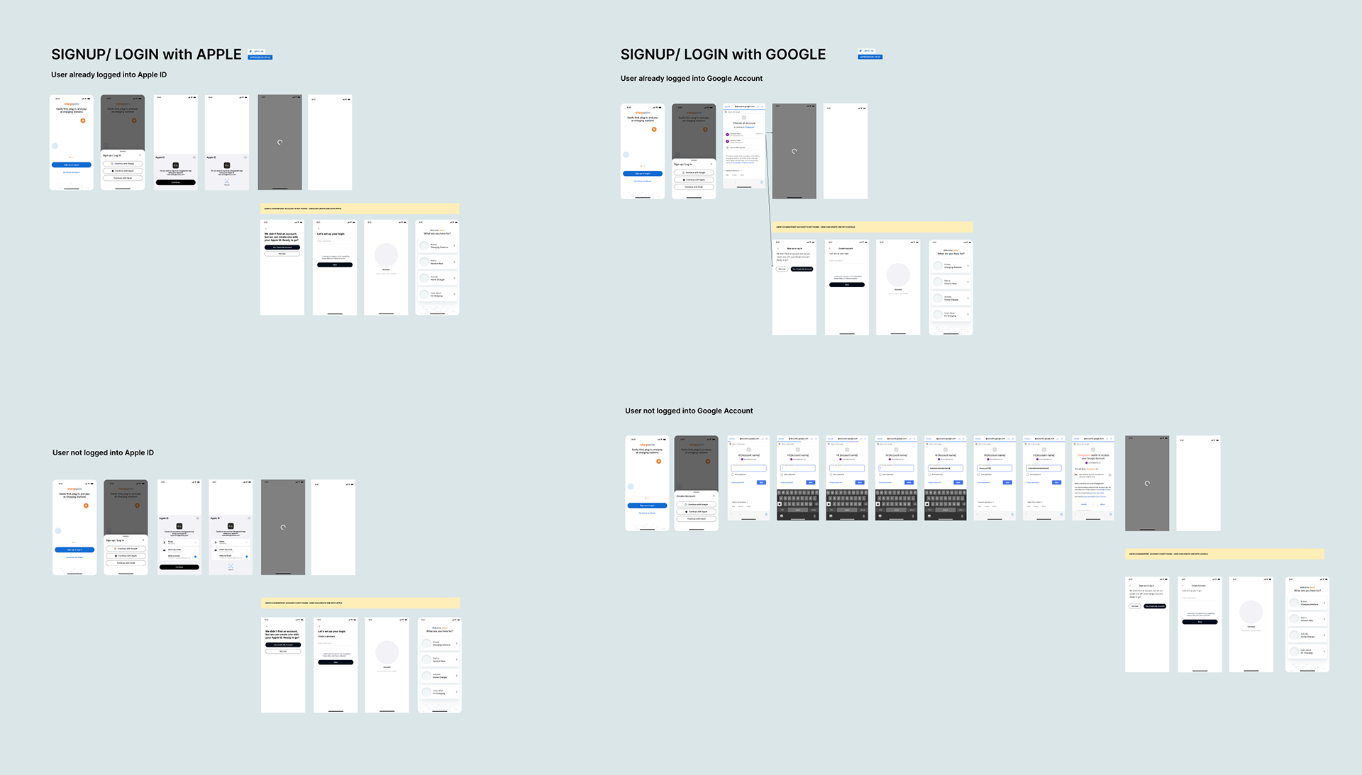
Apple & Google Account Signup and Login
⚡︎ Unified third-party authentication flows
⚡︎ Reduced friction for first-time users
⚡︎ Improved continuity between sessions and devices
⚡︎ Unified third-party authentication flows
⚡︎ Reduced friction for first-time users
⚡︎ Improved continuity between sessions and devices
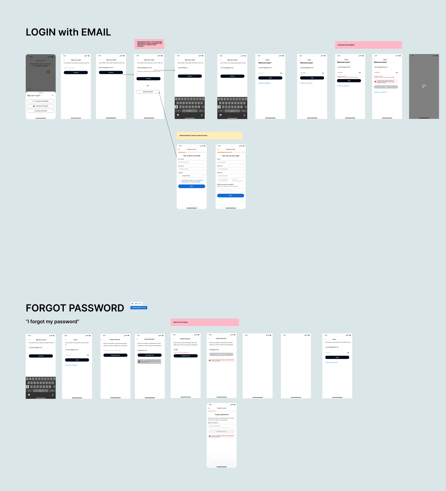
Email Login, Password Recovery
⚡︎ Clear, linear recovery paths
⚡︎ Reduced abandonment during credential failure
⚡︎ Consistent error handling and recovery feedback
Mapping the entire ecosystem exposed and resolved UX patterns that had quietly fragmented the experience.