One destination for profile, sign-in, and security
EXECUTIVE SUMMARY
Business Challenge
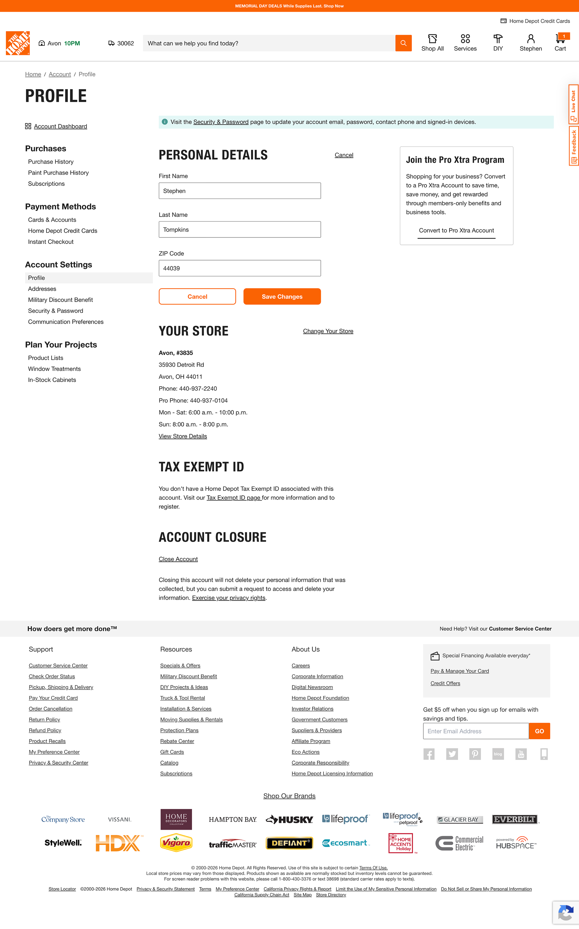
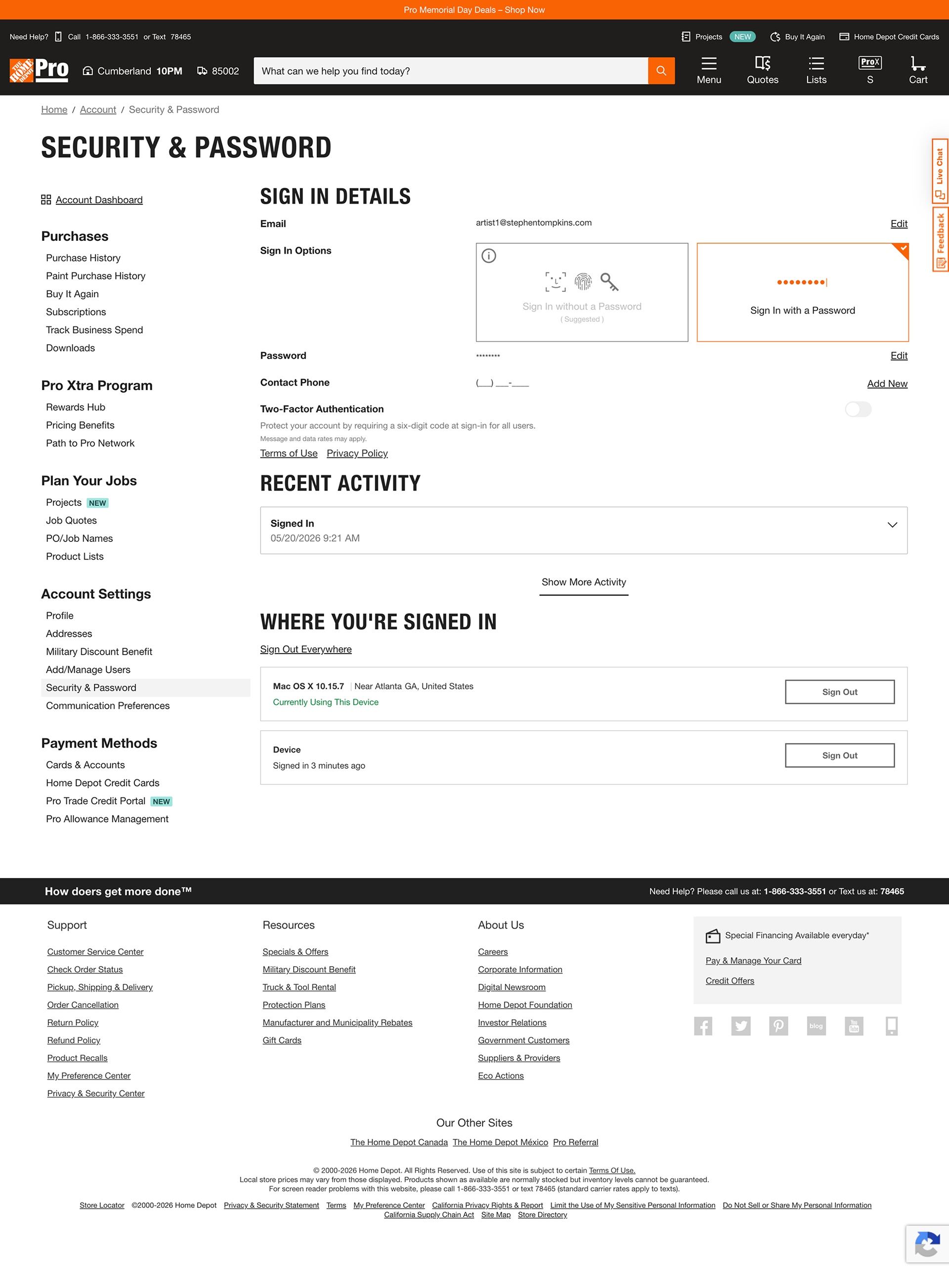
Home Depot’s existing Profile and Security & Password experiences separated closely related account information across two distinct, non-proximate navigation destinations. Customers managing basic account details could reasonably enter Profile, only to encounter a small instructional link directing them elsewhere for email, password, phone, authentication, and signed-in devices.
The challenge was larger than making security settings easier to find. The underlying information architecture created an unclear boundary between personal identity and account security, increasing navigation effort and weakening information scent.
The challenge was larger than making security settings easier to find. The underlying information architecture created an unclear boundary between personal identity and account security, increasing navigation effort and weakening information scent.
My Role & Responsibilities:
Senior UX / Product Designer
I led the UX analysis and concept development, including heuristic evaluation, information architecture, competitive pattern analysis, responsive interaction design, account-security state modeling, and usability-testing planning.
I worked closely with the Product Owner and Engineering team to align on a consolidated Profile & Security direction.
I led the UX analysis and concept development, including heuristic evaluation, information architecture, competitive pattern analysis, responsive interaction design, account-security state modeling, and usability-testing planning.
I worked closely with the Product Owner and Engineering team to align on a consolidated Profile & Security direction.
⚡︎ Conducted heuristic analysis of the existing account experience
⚡︎ Identified navigation and information architecture issues
⚡︎ Reframed Profile and Security around a unified mental model
⚡︎ Explored alternative IA and interaction models
⚡︎ Designed responsive desktop and mobile experiences
⚡︎ Modeled secure and under-protected account states
⚡︎ Collaborated with Product and Engineering
⚡︎ Developed a moderated usability testing plan
Approach
I reframed the problem from a page-level usability issue into a broader account-management challenge:
Understand the existing experience → identify the structural IA problem → consolidate Profile and Security → design responsive account states → prepare the concept for validation.
The resulting direction combined two previously separate destinations into one predictable experience for managing identity, sign-in, authentication, passkeys, and active sessions.
Understand the existing experience → identify the structural IA problem → consolidate Profile and Security → design responsive account states → prepare the concept for validation.
The resulting direction combined two previously separate destinations into one predictable experience for managing identity, sign-in, authentication, passkeys, and active sessions.
Project Status
The concept received strong cross-functional support and progressed into responsive design and validation planning. I left Home Depot before usability testing, engineering implementation, and launch were completed.
UNDERSTAND
I began by evaluating the existing account experience to identify where navigation, terminology, and security-related tasks were creating unnecessary friction.
⚡︎ Reviewed the existing Profile and Security & Password experiences
⚡︎ Evaluated navigation hierarchy and information scent
⚡︎ Analyzed friction across key account-management tasks
⚡︎ Examined semantic consistency across Profile, identity, and security concepts
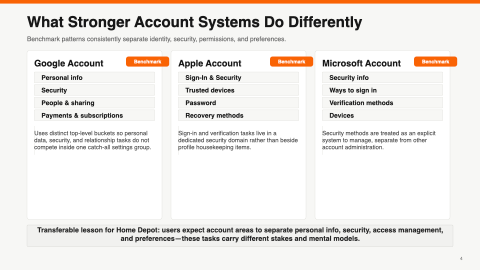
⚡︎ Benchmarked mature account-management patterns
⚡︎ Evaluated navigation hierarchy and information scent
⚡︎ Analyzed friction across key account-management tasks
⚡︎ Examined semantic consistency across Profile, identity, and security concepts
⚡︎ Benchmarked mature account-management patterns
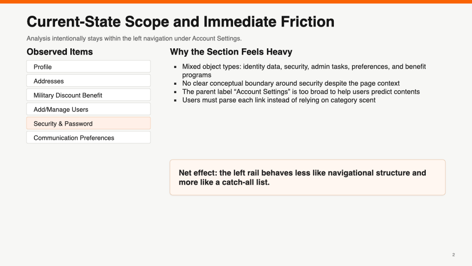
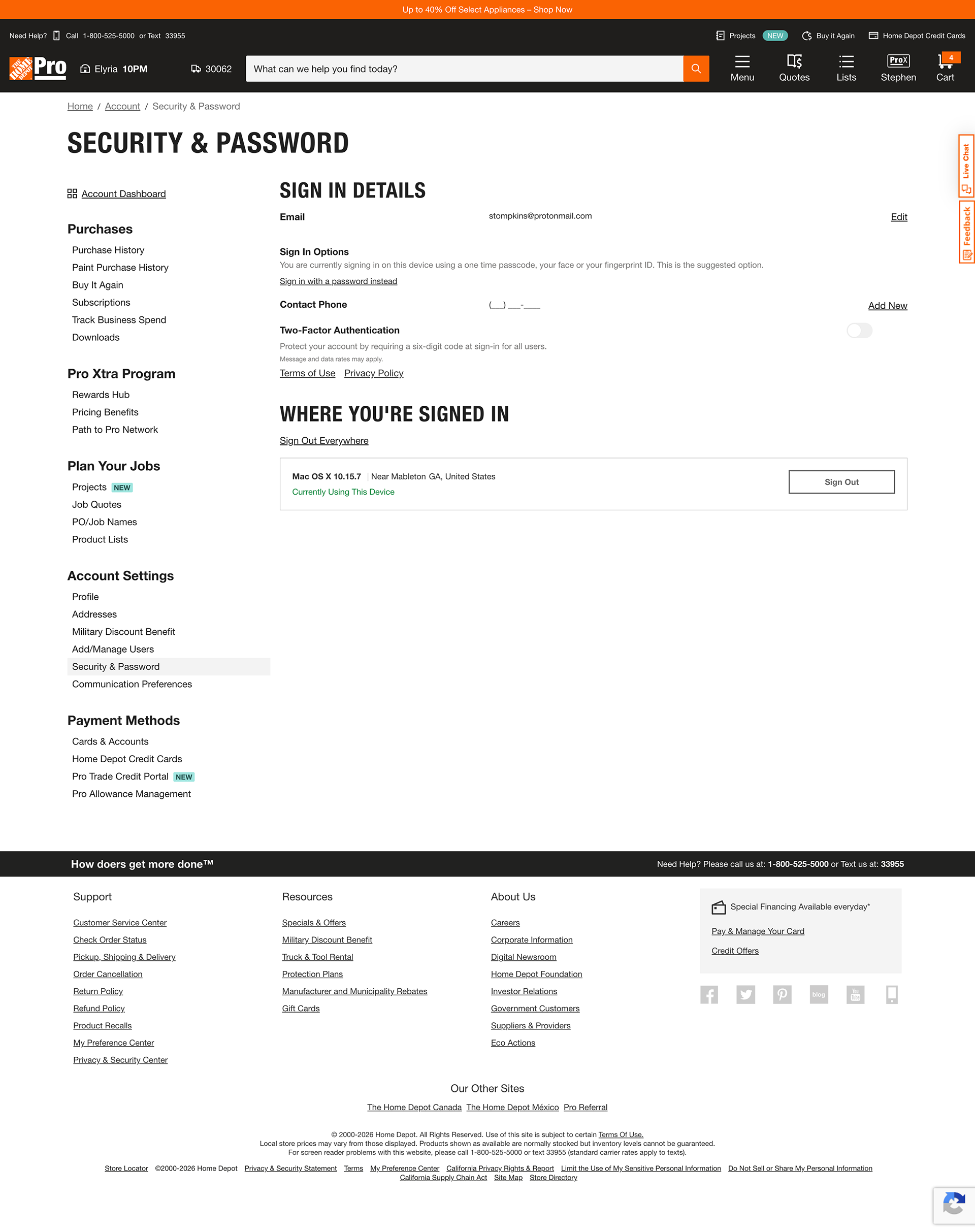
Artifact 1 - Current State
The current experience fragmented identity and security across separate pages, weakening information scent and task findability.
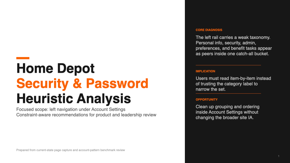
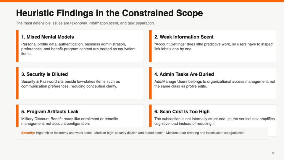
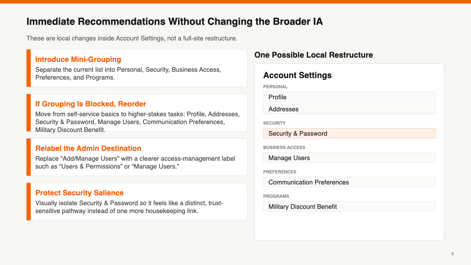
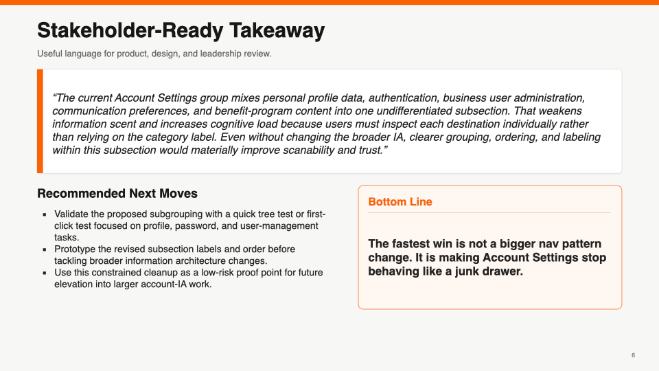
Artifact 2 - Analysis & Diagnosis
Investigation & Executive Readout: I analyzed the Account Settings experience across taxonomy, information scent, hierarchy, and task grouping. The findings exposed mixed mental models, diluted security visibility, and a navigation structure that made related account tasks harder to predict and find.
DEFINE
The analysis showed that the core issue was not simply password discoverability. Profile and Security were organized as separate destinations even though customers could reasonably perceive them as part of the same account-management task. I reframed the problem around creating a clearer, more predictable relationship between identity, sign-in, and security.
Artifact 1 - Problem Definition
How might we make identity and security settings easier to find and manage without requiring customers to understand Home Depot’s existing account taxonomy?
Artifact 2 - Navigation & IA Direction
The first structural decision was to consolidate two separate, non-proximate destinations into a single Profile & Security entry point. This reduced navigation choice, removed the need for cross-page redirection, and created a more predictable mental model for managing identity and security.
Artifact 3 - Defining Account Security Awareness
How might we help customers understand their account security at a glance and clearly see what they can do to improve it?
Protected Account
Reassure customers when recommended protections are active.
Needs Attention
Identify missing protections and turn them into clear next actions.
DESIGN
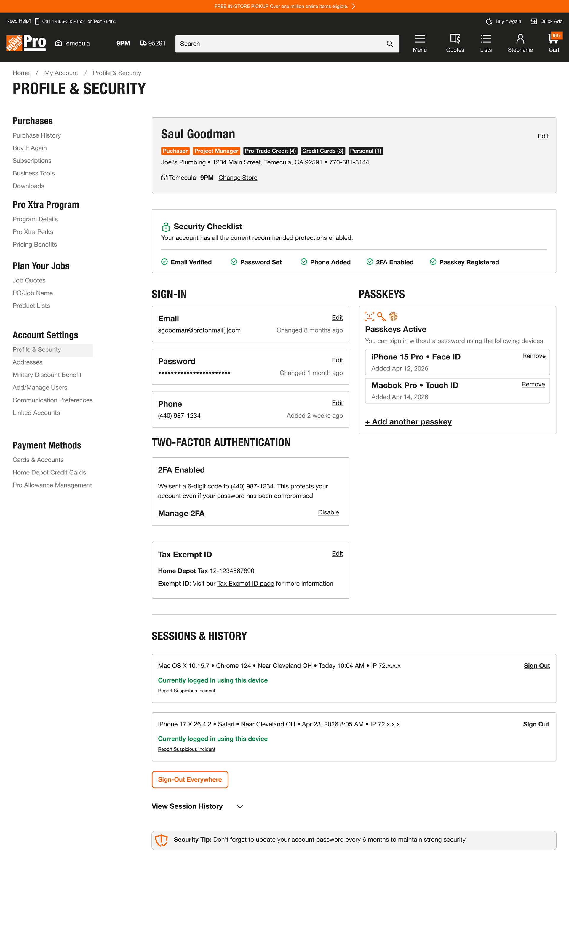
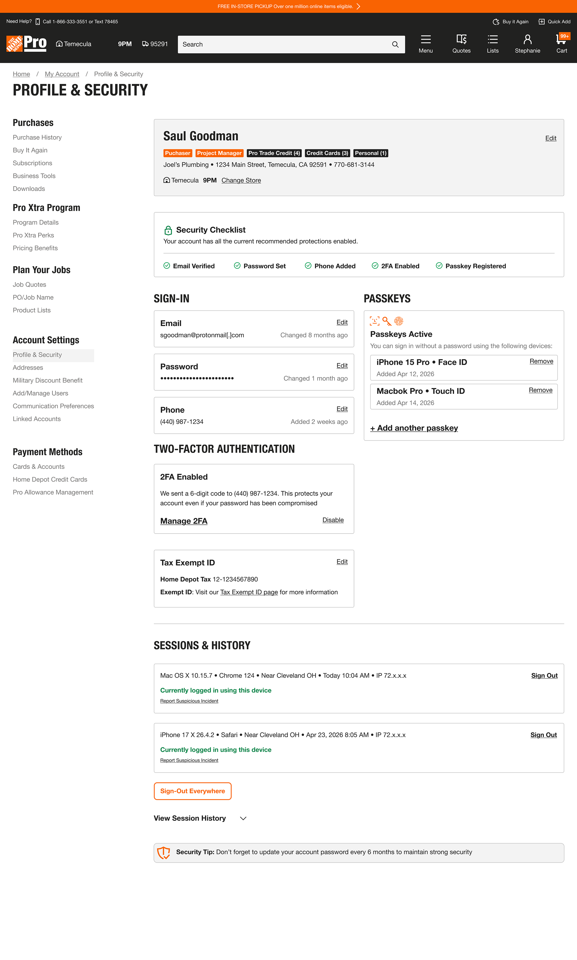
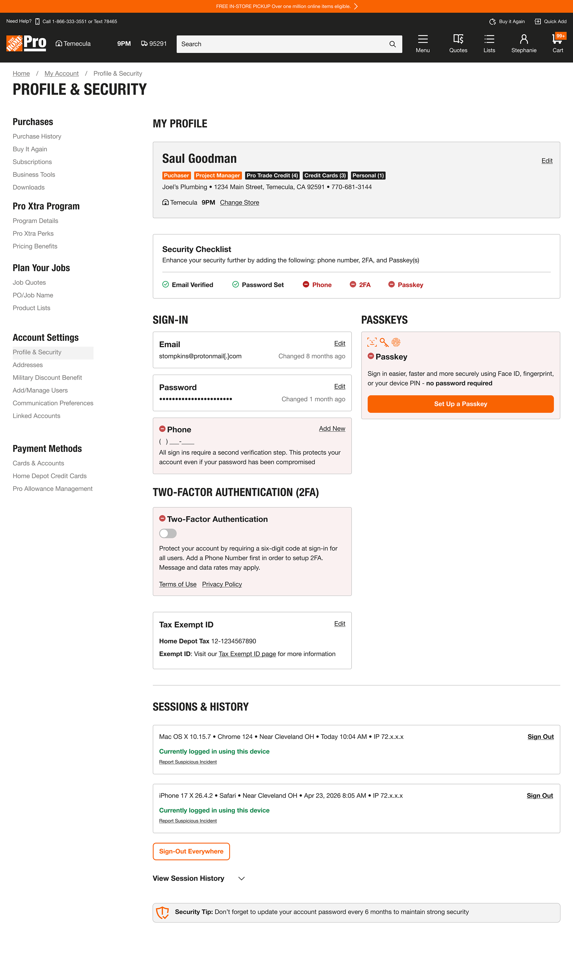
I translated the defined IA and security-awareness principles into a unified responsive experience across desktop and mobile. The design brought profile, sign-in, authentication, passkeys, and session management into one destination while adapting the interface to different levels of account protection.
⚡︎ Unified Profile & Security experience
⚡︎ Responsive desktop and mobile layouts
⚡︎ Security Checklist with protected and needs-attention states
⚡︎ Clear remediation paths for phone, 2FA, and passkey setup
⚡︎ Session visibility and account protection controls
⚡︎ Responsive desktop and mobile layouts
⚡︎ Security Checklist with protected and needs-attention states
⚡︎ Clear remediation paths for phone, 2FA, and passkey setup
⚡︎ Session visibility and account protection controls
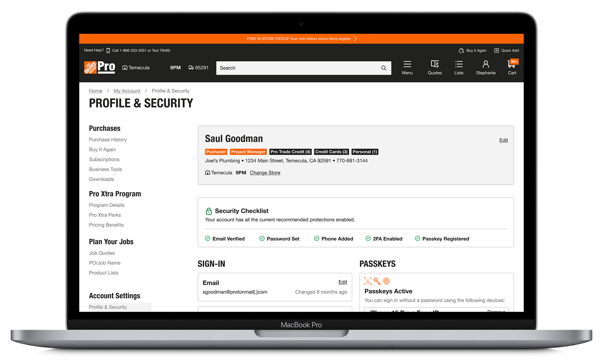
Artifact 1 - Desktop Solution
Artifact 2 - Mobile Experience: Secure Account vs. Needs Attention
I designed the mobile experience to communicate account security state clearly while respecting the constraints of vertical scrolling. A collapsed Security Checklist gives customers a lightweight at-a-glance signal, while the expanded secure state reveals active protections using green success indicators for quick reassurance.
For under-protected accounts, the experience shifts from reassurance to guidance: the checklist summarizes what is missing, and related section cards use Home Depot’s warning color treatment to draw attention to specific actions such as adding a phone number, enabling 2FA, or setting up a passkey.
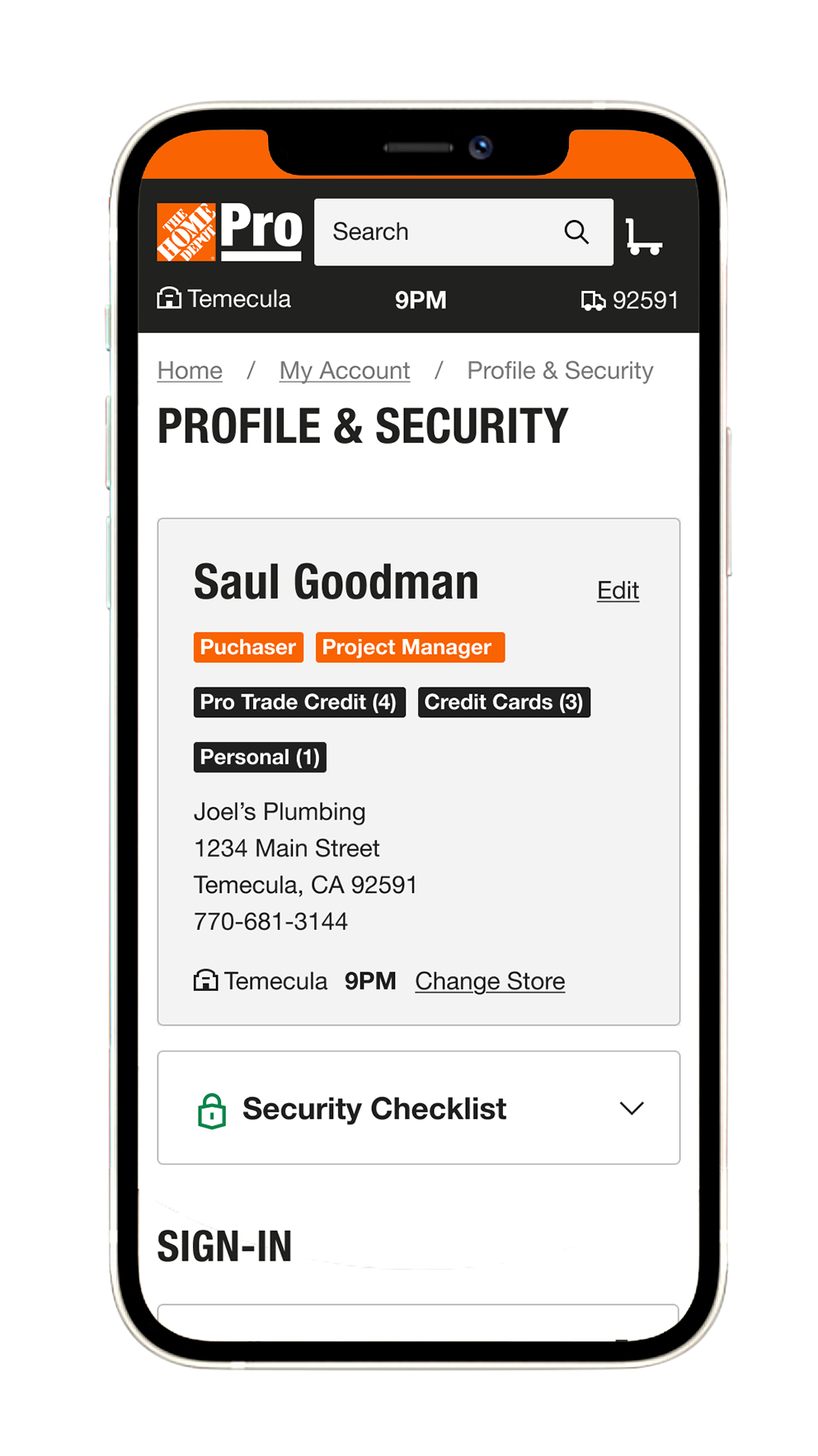
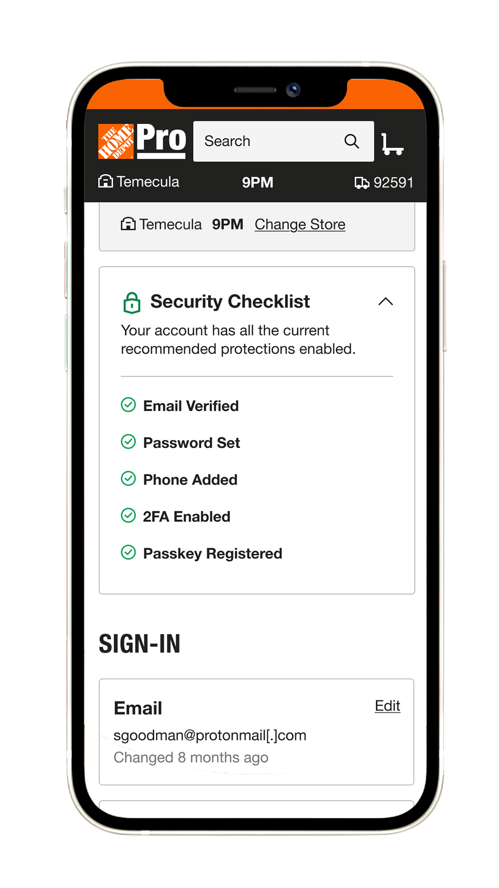
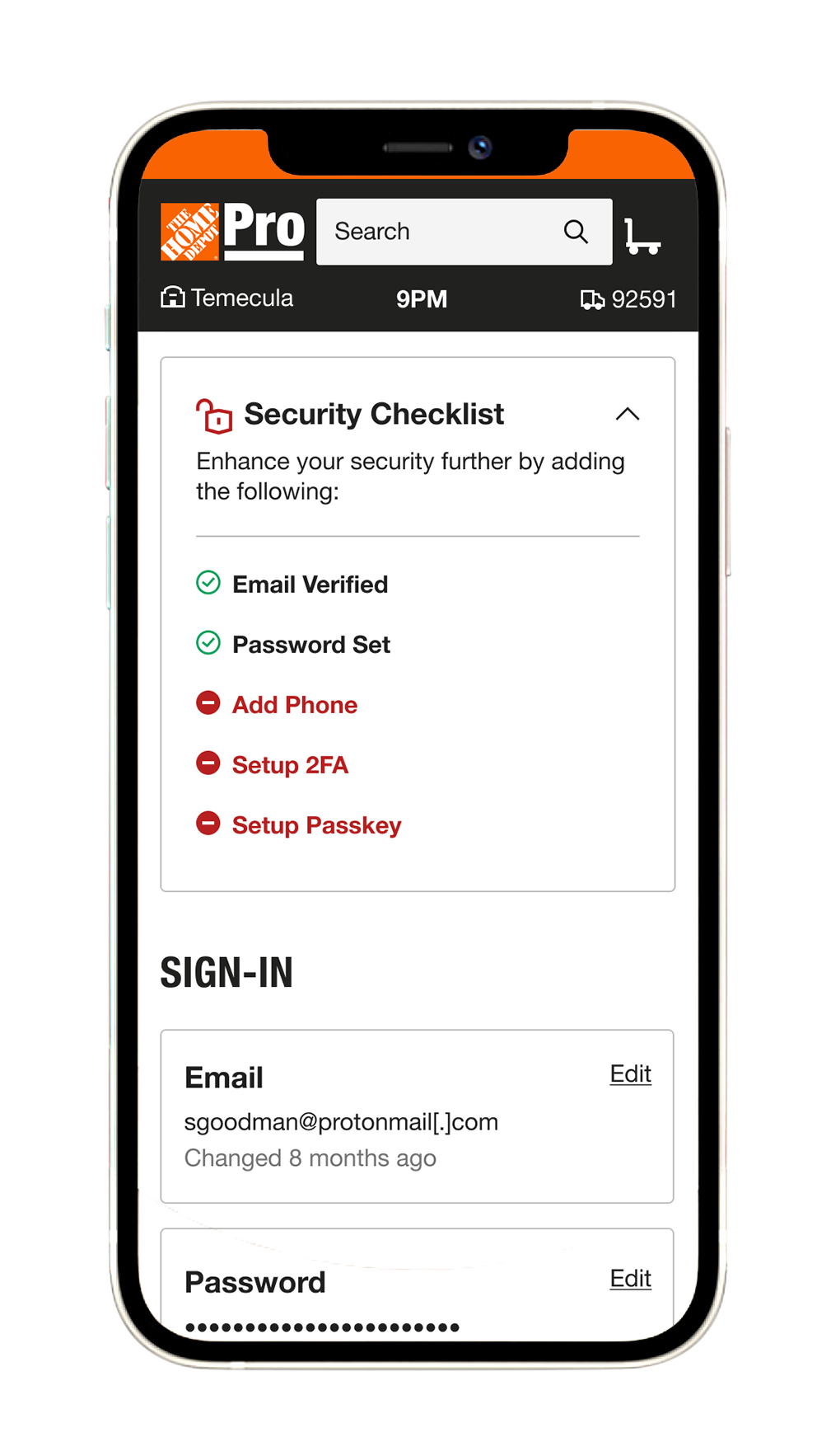
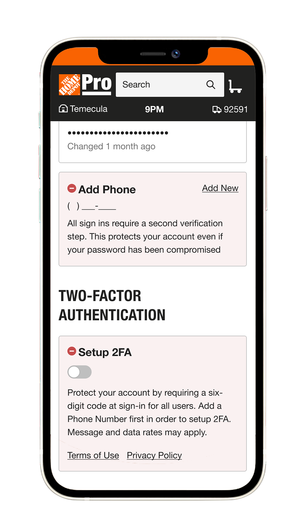
The mobile states give users quick visual reassurance when their account is secure and, when needed, clear guided actions to strengthen protection.
VALIDATE
I translated the design direction into a moderated usability study to test whether customers could understand the new Profile & Security model, identify their account security state, and complete key protection tasks with less ambiguity.
⚡︎ Defined research objectives and success criteria
⚡︎ Prepared moderated interview scripts and task scenarios
⚡︎ Configured the study in dscout
⚡︎ Designed secure and under-protected account scenarios
⚡︎ Prepared comparative concepts to test information architecture and findability
⚡︎ Partnered with the User Research team for planned interview execution
Artifact 1 - Usability Testing Plan
Moderated Research Script & Dscout Study Setup
I prepared the study structure, interview script, task scenarios, and prototype states for moderated testing. The research was designed to evaluate navigation comprehension, security-awareness cues, password and authentication findability, and the clarity of recommended next actions.
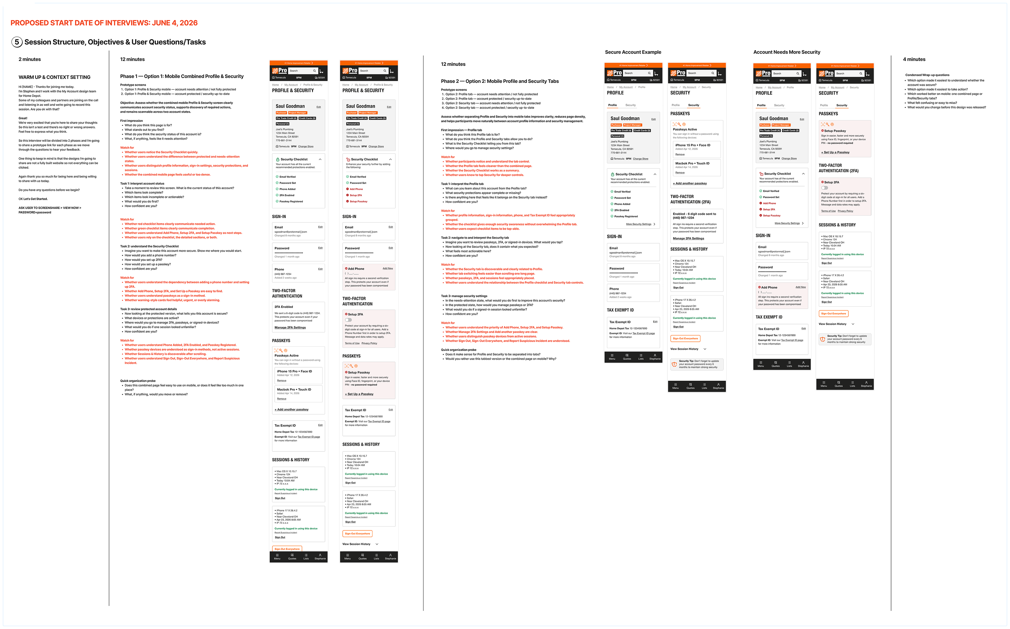
Project status:
The study was prepared and configured for execution with Home Depot’s User Research team.
I resigned before the scheduled interviews were conducted, so no usability findings or post-test outcomes are attributed to this work.
SCALE
⚡︎ Created a unified Profile & Security model that could support future account capabilities
⚡︎ Established patterns for secure, partially protected, and needs-attention account states
⚡︎ Designed responsive behavior across desktop and mobile
⚡︎ Created a foundation for additional authentication methods, passkeys, and session-management tools
⚡︎ Aligned the concept with Product and Engineering before planned user validation
⚡︎ Established patterns for secure, partially protected, and needs-attention account states
⚡︎ Designed responsive behavior across desktop and mobile
⚡︎ Created a foundation for additional authentication methods, passkeys, and session-management tools
⚡︎ Aligned the concept with Product and Engineering before planned user validation
OUTCOME
⚡︎ Consolidated two separate, non-proximate destinations into one Profile & Security experience
⚡︎ Removed the need for cross-page instructional redirection
⚡︎ Made account-security status visible at a glance
⚡︎ Added clear guidance for customers with missing security protections
⚡︎ Extended the solution across desktop and mobile account states
⚡︎ Earned strong alignment from Product, Engineering, and leadership
⚡︎ Prepared the experience for moderated usability validation
⚡︎ Removed the need for cross-page instructional redirection
⚡︎ Made account-security status visible at a glance
⚡︎ Added clear guidance for customers with missing security protections
⚡︎ Extended the solution across desktop and mobile account states
⚡︎ Earned strong alignment from Product, Engineering, and leadership
⚡︎ Prepared the experience for moderated usability validation
I left Home Depot before the planned user interviews, engineering implementation, and launch. The work shown represents the aligned design direction and completed validation plan at the time of my departure.
REFLECTION
This project reinforced the value of solving UX problems at the structural level rather than treating their visible symptoms. The original experience attempted to compensate for fragmented information architecture with instructional links and separate destinations. By questioning that structure, I was able to simplify navigation, clarify the relationship between identity and security, and introduce a more proactive model for communicating account protection.
It also demonstrated the value of designing ahead of the immediate roadmap: identifying an opportunity, building cross-functional alignment, and developing the concept far enough that it could become a testable product direction.
Clear information architecture turns account security from a hidden setting into an understandable experience.